
Monday February 22 2021
Remember when we were heard the news that we reached the milestone of 100,000 deaths in the U.S. due to COVID-19? When was this? Can you take a guess?
I was thinking early summer 2020. That was a little late on the mark.
The New York Times recognized this macabre event on their front page in May 2020. And here we are today, just a few gestational nine months later, nearing 500,000 COVID-19 deaths. A half million people in the United States.
Now the New York Times has published an updated front page graphic to get your attention. It starts with a single dot that grows to almost a half million in less than one year’s time.
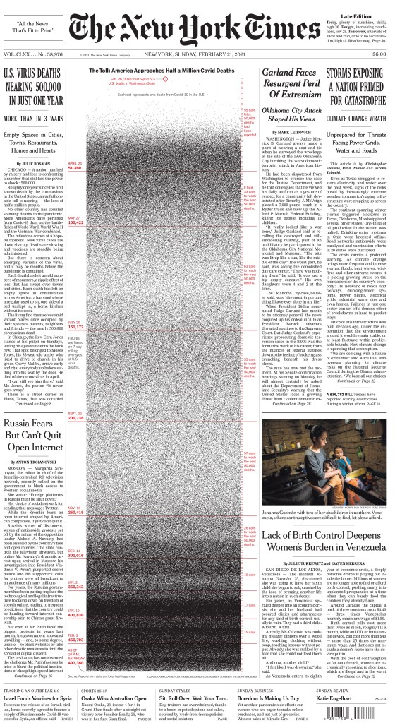
There is just a certain numbness. I think, that is normal human nature when this has been going on for so long, but we’ve tried to just keep reminding people of what’s still going on. And I think something striking about this particular piece that we were trying to drive home is just the sheer speed at which it was all happening.
Lauren Leatherby, Graphic Editor, The New York Times
https://www.nytimes.com/2021/02/21/insider/covid-500k-front-page.html
Some of us are visual learners and can understand the impact of dots collecting into a black mass. Others want another type of reference, like how do these numbers compare to other events with a high mortality rate, such as war casualties.
More than 3,000 people are dying from COVID-19-related events every day. That’s more than those lost in the single day 9/11 or Pearl Harbor attacks. The Federation of American Scientists has tallied the deaths in World War II at a total of 405,399. But it is appropriate to compare the pandemic’s death toll to those lost in wars? Some people don’t think so.
The WWII deaths were a majority of young men who signed up for the noble cause of defending our country, while we refer to those who’ve died from COVID-19 as victims. And it’s our elderly population that has been hit the hardest. Apples and oranges, as they say.
Or is it, really? When we consider the mortality of the first World War (1914-1918), the death toll is intermingled with the flu pandemic. Of the 116,516 U.S. lives lost during WWI, more U.S. soldiers died of influenza and pneumonia than by enemy weapons (source: https://www.ncbi.nlm.nih.gov/pmc/articles/PMC2862337/), so we have a precedent for the comparison of these very different battles of pandemic vs. war mortality rates.
So how do we understand the impact of 500,000 lives lost within a year to a virus? Every dot on The New York Times graphic represents a parent, grandparent, brother or sister, a life partner, somebody’s child, or best friend. And with certainty, a person who made an impact within their individual world is represented with a speck to validate their life.
Last month, January 2021, we experienced the highest number of COVID-19 related death in one month at 95,458 American lives lost. But there’s hope that we’ll start to see the numbers decrease as the coronavirus vaccines are distributed. In Ohio the vaccines are being administered to front-line healthcare workers, then by age groups, starting with our oldest population. Right now the age threshold is 65 years old and those younger are told we have to wait a few more weeks. The vaccine being given now requires two shots, the initial followed by a booster shot after a few days.
Several of my work colleagues, who are either of age or have an underlying heath condition, have been vaccinated. My mom is scheduled for her second.
It feels like maybe we can finally turn a corner here. Even with the threat of the new coronavirus strain coming our way, progress is being made. We now have a sword and shield for this battle.
We now can be fighters instead of victims.
