
Saturday November 21 2020
Ohio has assigned its first Purple County this week, a phrase that would have induced a raised eyebrow a year ago. “What is this purple county you speak of?” we would have asked, as our thoughts wandered to flowers, cows, grapes, rain, and the artist formerly known as Prince.
Today we know this otherwise lovely hue is the color of doom, only worse in its foreboding than red. And Franklin County gets the stain of it.
“Level 4, or Purple, is the highest level of the Ohio Public Health Advisory System. When a county reaches Purple, it means it has met at least six of seven indicators of concern for COVID-19 spread for at least two consecutive weeks. Residents should only leave home for supplies and services.”
Source Ohio.gov

Meanwhile, our home county of Montgomery remains in the red zone. A health advisory has been issued here to encourage us to stay at home as much as we can. Only leave the house for work, groceries, and other necessities to maintain life is our governmental guidance. ‘Tis merely an advisory, to which the leaders are giving us, the citizens of Montgomery County, the power to do the right thing in slowing the spread of COVID-19 to our friends and neighbors.
Of course, the only thing people will do is continue to complain, right? Nobody is going to change.
“You can’t tell us what to do, Government,” they say, clicking their mandated seatbelts for the drive to Walmart. “We’re grown ass adults living in a free country.” I remind you these are the same folk that dismiss the color-coded map as ridiculous because, wake up people, how does the virus know to respect county boundaries?
Yeah, I wish I were kidding.
While we don’t have any yellow counties at Level 1 in Ohio, there are a few holding steady at Level 2’s orange. These areas are seeing recent increased exposure and spread, so are asked to be vigilant about washing hands, wearing masks, and social distancing.
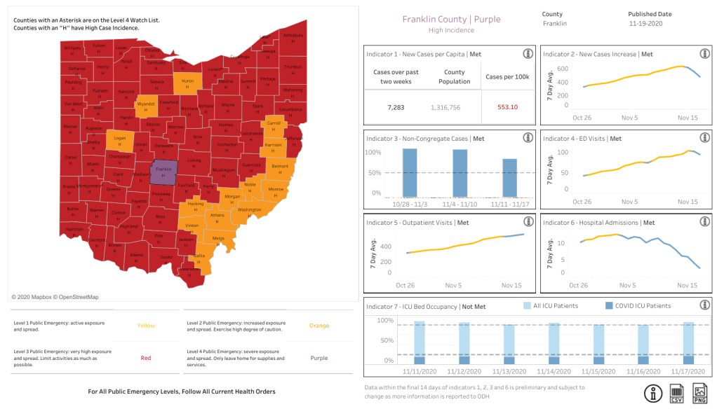
It’s interesting to see a cluster of orange counties along the eastern border of Ohio, which is our Appalachian population.
Here’s another map to consider, courtesy of the Appalachian Regional Commission.


It takes a moment to get your bearings on this socio-economic map of Appalachia counties, but guide your gaze to the center of the image to see Ohio’s eastern state line in bold black. The counties in red on this particular map reference high-poverty level, with the pockets of the most challenged communities in bright yellow.
I’m not sure why this area of our Ohio hasn’t reached the same COVID-19 emergency level as the rest of the state, but I think we all can hazard a guess. Likely fewer community resources such as easily accessible grocery and big box super-stores, not as many densely populated communities, and less attainable health care. I’m left to wonder if the transmission is truly lower here than other more prosperous counties or if, instead, it may be that fewer people are being tested due to constrained resources. However, at Level 2 COVID-19, it appears things are ramping up either way.
As we end this week and move into next, I wish the next few days bring Yellow Coding to everyone. It’s the best I’ve got for ya, but I mean it sincerely.

